 |
| This is how it came out of the camera - and is how I like it best. |
 |
| This is the same photo in black and white. In some ways, it doesn't look much different but I miss the blue-ish sheen. |
 |
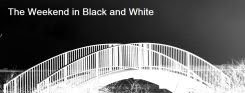
| When changing a photo from a grey day into black and white I often like to go for shapes rather than tones. Here is the same photo with the brightness and contrast adjusted. Pretty bold, eh? |
7 comments:
I like the original best.
I think I agree Lucy, that wee hint of blue in the first image adds to the image.. good fun to experiment though ☺
Great structure. I prefer te first one - but it is fun to experiment!
I like the strong lines in this photo. I agree about the first - very attractive!
Love the abstract feel of these
Mollyxxx
Helloo Everyone - seems we agree - the first one is best. I find this satisfying when things come out 'right' first time. (And I like abstract.) Thanks for your comments, folks.
I like the starkness in the last pic.
Post a Comment